How to Get More Email Subscribers: 9 Proven Tactics to Optimize Your Email Opt-In Pages (With Examples & Supporting Studies)

Don’t let your website visitors escape!
Image courtesy of Vincepal under CC 2.0.
Tell me if this scenario sounds familiar:
1. You’ve just started a website (or have been struggling to make money online for years) and have added an email opt-in page to your site.
2. You’re driving traffic to that page with paid traffic…or maybe you’re relying solely on drips and drabs from organic traffic.
3. A few people are opting in on your page (hurray!), but when you look at the opt-in rate, it’s a miserable 5% (or 10% or 15%).
Even an opt-in rate of 15% means that 85% of visitors to your opt-in page are fleeing!
I used to have dismal opt-in rates – until I did some digging and found a handful of tactics that increase opt-in rates. Now I use these tactics as a sort of “checklist” to figure out how I can encourage visitors to my site to give me their email address.
Following are 9 proven tactics for optimizing your email opt-in page. I’d encourage you to test out each one on your own site to see how they perform with your visitors.
1. MAKE A COMPELLING OFFER.
The bottom line for your subscriber will always be “What’s in it for me?” Don’t make people search for the benefits, cut to the chase and highlight the benefits prominently on your email opt-in page.
Austin McCraw of the Marketing Experiment Blog states that the Value Proposition, or what you are offering your customers, is the foundational element marketers should test using PPC ads. The same holds true for your email opt-in page.
Give your visitors a reason to be excited about subscribing to your email list. Make them an offer they can’t refuse by providing an exciting incentive that benefits them, in exchange for their email address.
Case Study: Rob Cornish Doubled His Email Opt-Ins By 167% With An E-Book
When Rob Cornish of Gain Higher Ground set out to boost his email opt-in conversions, instead of the video he had previous been using, he began offering an e-book called “101 Profitable Niches Analyzed”.

With a simple change to his opt-in form, Rob began to capture double the amount of users who otherwise would have just fallen through the cracks. Instead of his previous video offer, Rob chose an image of his e-book, which by title was already extremely relevant to his ideal customer – the online entrepreneur.
Instead of a non-scannable, unknown video, Rob pumped up the benefits with a downloadable e-book of clear interest and doubled his conversions from 5.4% to 11.3%.
A person’s email address is a highly-valuable commodity. In order to convince a person to share that commodity, you must “sweeten the exchange” by, among other things, proving your website’s trustworthiness and credibility.
According to Marketing Sherpa, “Tactics that deliver value to the customer such as purchased products, downloaded material and webinars develop trusted relationships which enable customers to share email addresses and contact information.”
There are many ways you can provide apparent value to customers in exchange for their email address. However, when you know and understand what it is that your customers want (through good niche research), you can easily figure which incentives will be most effective.
Case Study: Squaw Valley Ski Resort increased email conversions to 30% with a relevant Facebook contest
In another case study provided by Inside Facebook, they utilized the power of social media to reach a young, mobile audience. By promoting a Facebook giveaway contest to their already engaged Facebook following, Squaw Valley Ski Resort was able to capitalize on the timing of the 2014 Winter Olympics to drive a 30% conversion rate.

For your business, the incentive should be totally unique and customized to the passions, interests, needs, and desires of your target audience.
2. OPTIMIZE YOUR HEADLINE.
Most marketers and copywriters will tell you that your headline is the single most important element of your opt-in page. In fact, according to CopyBlogger, 8 out 10 people will read your headline, while only 2 out of 10 will read the rest.
The headline is so important that some of history’s best copywriters (like Eugene Schwartz) spent up to a week just crafting the headline for ad (after in-depth research into the market, of course).
Your headline has some heavy lifting to do: it needs to not only grab your readers’ attention, but it must also compel them to take action.
Because your headline is the very first element your readers will see, and because of the potential impact it can have on whether or not your copy gets read, it’s worth your while to spend time testing and tweaking it.
For instance, in one case study, Reebok was able to increase email opt-in conversions by 40% with one simple text change: and all they had to do was change their headline copy from ‘Join the Reebok Newsletter’ to ‘JOIN AND SAVE’.
According to John Caples, one of the most effective copywriters of all time, and author of the 1932 marketing classic ‘Tested Advertising Methods’, there are 5 elements to an effective headline:
1. Self Interest: Your headline should let the reader know there is something ‘in it’ for them. What is the benefit to your reader? How does your offer apply to them?
2. News: If there’s anything news-related in your content, be sure to somehow get this across in your headline.
3. Curiosity Isn’t Enough: Piquing your readers’ curiosity can be effective, but only when done in conjunction with self-interest or news.
4. Keep it Cheerful: Use a positive angle when possible.
5. Keep it Simple: Be sure to mention that there is a quick and easy way to receive the benefit you’re promised.
If you’re looking for more ideas for your headlines, check out this great post by Unbounce: 5 Landing Page Headline Formulas You Can Test Today.
Case Study: How Changing Your Headline Can Increase Conversion Rates
When Highrise changed the headline on their opt-in page, they immediately saw a 30% improvement in signups.

Original Headline
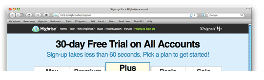
Optimized Headline
Notice that the headline in the optimized opt-in page above utilises the element of self interest (see above). With bold letters and a dominating font size and distinct black color the headline announces that someone can use the services of the site without any risk for 30 full days.
Plus, it asks for a mere 60 seconds from the reader.
The same headline with a lot more text showed only a 7% improvement in sign-up rates compared to the one that they had used before.
Notice that when the element of time saving was taken away the offer seemed less appealing.

Case studies such as these go to show that when you understand your audience you’ll more easily find a way to connect with them and influence their behavior.
A simple way to optimize your headlines is to test various versions and then monitor the change in conversion rates using a tool like Google’s Content Experiments or Visual Website Optimizer (which is what I use). Make sure to support each headline with explanatory text on the page that elaborates on what the subscriber will get and the associated benefits.
3. USE A STRONG CALL TO ACTION.
The call to action is similar to the ‘point of sale’ at the checkout counter. You want the user’s experience to be seamless. All the convincing and persuasion has gotten them this far, and the last thing you want to do at this place is to frustrate or deter visitors from sealing the deal.
Conversion XL lists the Call to Action among the 20% that makes 80% of the difference in conversion optimization.
Let’s take a look at a couple of examples of how a strong call to action can have a serious impact on conversion rates.
4 Ways You Can Test Your Call to Action
Your call to action button is one of the easiest elements to test, and can have a huge impact on your conversation rates.
Following are 4 things you can test when it comes to your CTA buttons.
i. Try different button colors.
While there are varying thoughts on button color, the folks at WiderFunnel found the big orange button (also known by the name “BOB”) led to a 32.5% increase in lead generation.
Here’s a prime example of a BOB on the website of Unbounce, a company known for rigorous testing.

Different colors have different meanings. For instance, while red is an exciting color, it can also be a sign for “stop”.
In another study done on the website for marketing automation company Performable (which is now owned by Hubspot), the red button received 21% more clicks than the green button.

While the arguments vary, one maxim is that the odd one stands out. If you give a contrasting color to the CTA button then it will surely gain attention (but might not get a conversion, of course).
In the example below, not only has MailChimp effectively used whitespace but also the red CTA stands out perfectly in stark contrast to the white background.

ii. Play around with your call to action text.
Never use a dull statement that doesn’t inspire action. Remember that the most effective headlines are the ones that carry self-interest. Your call to action text should serve that self-interest.
Positive statements like the one below enhance sign-ups.

If it’s a free report that you’re subscriber is getting, then explain what it will do for them through your CTA.
Using verbs like “get”, which focus on the benefit to the user, have increased the click through rates by over 32% to 40% in different studies.
CareLogger is an example of a company who achieved great results simply by changing the text in their CTA button. They noticed a 7% improvement in conversions when button text was changed from “Signup for free” to “Get started now”.
Remember how in headlines self interest matters? Research done by Unbounce has shown that the word ‘get’ can make a big difference in your conversion rates. It gives visitors the sense that there is a timely benefit for them.
The example below shows how changing ‘Order’ to ‘Get’ increased conversions by a whopping 14.79%.

Image courtesy of Unbounce
iii. Use lots of whitespace.
Oli Gardner of Unbounce advises giving some breathing space to the CTA with whitespace. With the right measure of whitespace the CTA stands out effectively.
To see another example just go to PayPal and see the effective use of whitespace (or, in this case, brownspace), the big CTA button and color contrast generated with blue in action.

iv. Use direction cues.

The heatmap results of 106 people looking at the webpage above show the redder the spot, the more time people spent looking at the spot.
Now look at what happens when the baby looks at the CTA. Notice how the red spots are now on the CTA.

You can use direction cues to direct the attention of the readers to your CTA. The technique is so powerful that one of the biggest blogs on the planet uses it.
4. BE CAREFUL HOW MUCH INFORMATION YOU ASK FOR.
Another ultra important factor in determining the success of your opt-in form or page is the amount of information that is required from the user. Be sure to keep the information at a minimum; however, as always, test to see what converts the highest.
While a general rule is to keep the number of form fields to a minimum, for some businesses, a higher number of required form fields can present a level of credibility to potential consumers and drive more subscriptions.
Such is the case of TruckersReport.
Case Study: TruckerReport converted 13.56% more visitors by increasing the form fields.
TruckersReport is a website that truckers go to in order to find jobs as well as connect with other drivers. An email-only form field, in this case, would appear to be “spammy” and was proven not to convert as well as the multiple field form.

While “common sense” may conclude that fewer form fields convert at a higher rate, the results will vary from business to business.
Not convinced? Here’s another one:
Case Study: Kindercare, national childcare center franchise, tested two forms with a shorter length and longer length.

It turns out (drum roll, please!) that the longer form converted at a higher rate and led to higher quality leads than the shorter form.
Now, don’t run and add more form fields to your opt-in page. Too many irrelevant form fields will only annoy visitors and deter good leads from signing up. Request the necessary information and test and improve upon each format.
Now, let’s take a look at the flip side:
Flying Scot improved form completions by 35% by reducing the number of form fields on their site.
They went from this:

To this:

The form that you’re using should be relative to the type of services and benefits you are offering. If you’re offering a free e-book, and requesting the person’s name, address, phone number and other information that isn’t really needed, you can potentially put off customers from signing up for your offer.
5. ADD SOCIAL PROOF.
“Trust on the web is huge”, claims Kissmetrics when discussing the most important elements to boost email opt-ins.
Adding a few logos of acclaimed newspapers or businesses will show potential customers that your business is trustworthy and reliable. Often overlooked, adding social proof can dramatically increase your conversion rates.
The Conversion Rate Experts shared a case study, in which they helped increase email conversions by adding social proof to a client’s website. Top Cashback was soon the 5th fastest growing company in the UK (okay, maybe their growth wasn’t a direct result of adding social proof to their website. But you get the point!)
How did they do this? They first examined what was causing their non-subscribing visitors to drop off. The Conversion Rate Experts used a survey to determine the areas of improvement. Top Cashback is a company that offers rebates to their members who shop online and buy from their affiliates, but upon research, they discovered why they weren’t converting.
1. People didn’t understand how it worked.
2. Some people thought they wouldn’t get their cash back.
3. Some people figured that it was too good to be true.
4. Others thought there would be barriers to collecting their cash.
Customers were having a hard time deciding that they could trust this website. So, they added social proof.

CRE discovered that Top Cashback had been featured in several well-respected sources like The Guardian and the Independent. So, they tried to prove their credibility by placing the words “As Featured In” with well-known business logos near the “Join Now” button. This alleviated customer fears that it was “too good to be true”.
The end result was that they were able to reduce drop offs and improve conversion rates by 74%, simply by establishing a greater trust level with their audience.
Using Testimonials as Social Proof
One form of social proof that is often used is customer or client testimonials.
Testimonials are another form of stories. People tend to connect with stories because their brains believe them to be true.
Testimonials with pictures are even more powerful. Pictures have been associated with increased trust among people.
Also, research shows that people like looking at human faces.

Opt-in Page on the Copyblogger website
But not just any faces. Usability demi-god Jakob Nielsen says “A call center ad with a model in it on the phone may be a good picture technically, but it will more likely be ignored”. So, avoid using cheesy stock photos.
6. FREE STUFF DRAWS PEOPLE IN.
Here’s a “Duh!!” tactic for you: people love free samples. But guess what? They’ll not only gladly take a free sample, they’ll often end up buying the whole enchilada after trying the sample!
For food samples, in one study, at least 25% of the people trying the samples ended up buying the product.
In the digital space it’s easier to give something away, be it a free report, free series of online videos, or a trial copy of software.
I know this very well from personal experience. I’ve sold hundreds of thousands of dollars of health-related information products by first enticing people to give me their address, in exchange for an e-course on particular health treatments.
7. KNOW YOUR IDEAL LENGTH.
That’s right, fellas – size DOES matter!
Marketing Experiments conducted a test to see what converts best: short or long copy. In their test long copy outperformed short copy by a good margin in all tests.
While it certainly depends on your target audience, an easy way out of this problem is to use some other form of copy. See how Copyblogger uses a video on the landing page and very short text copy.

8. PLACE OPT-IN FORM IN TOP LEFT CORNER OF PAGE.
The top left corner of every webpage is the corner that receives the most attention. Scientists have used advanced eye tracking programs to come to this conclusion. Yahoo also conducted a similar study. It is always the top left corner that is viewed first.
So it makes sense to place the opt-in form in the top left hand corner of a webpage to increase sign ups.
Sometimes, it can be difficult to place forms in the top left hand corner of a webpage. The vast majority of WordPress themes don’t allow users to place widgets in the top left hand corner of the theme.Don’t worry. It’s still possible to optimize your opt-in placement without ruining the theme.
When Stanford Smith placed his opt-in form at the top of his blog he saw a 26% increase in signups when he moved his form to the top.
It’s better to place your opt-in forms above the fold but Jakob Nielsen suggests placing the most important content above the fold.
Eye-tracking software has given us some incredible insights into how people read. One of these insights is that people don’t read most of the text that is in front of their eyes; they scan it. In other words, they skip sentences quickly to find the information that they are seeking.
But they don’t scan text from the left side to right side all the way down the page, like you would imagine. Several different studies have been done on this topic, and all of them confirm this fact. People read the first sentence from the left to the right, then just half of the second sentence, and then just the first words of the third sentence, and so on.
In 2008 a study revealed that only around 20% of website visitors actually read the text on a given page; 28% at most.

The dark red zones in the image above represent where people look when they are browsing a webpage. It is important to remember that most people won’t read all of your content word for word. They will scan it for certain formats, such as bold text, and lists. Remember to include formatted text in your article if you want people to remember the point of each article. You can tell that most of the shapes resemble the letter F.
• The top left-hand corner of a website is the most popular spot.
• People read the first sentences of a website from left to right.
• Most people, when browsing websites, don’t read the text thoroughly.
• People scan articles for formatted text, such as this list.
• People read only about 27% of all text.
• People only read the first words of sentences after the first sentence in a paragraph.
See how Gregory Ciotti of HelpScout lists the benefits of joining his newsletter as bullets to facilitate easy comprehension.

9. CHOOSE THE BEST FORMAT FOR YOUR FORM
According to eConsultancy, overlays are the most powerful way to gather email opt-ins from new visitors, earning up to 400% more subscribers than inline forms.
With a squeeze page, conversions are optimized because it allows you more space to sell your benefits.
Michael Port increased his email opt-in conversion on his business blog by 167%, Book Yourself Solid, simply by switching from an email opt-in box on his homepage to a dedicated squeeze page.
Before:

After:

Squeeze pages have the advantage of providing clear, focused directions for the user as well as giving you the space you need to lay out the benefits to the consumer.
THE POWER OF TESTING
We’ve covered a lot of ground in this article, but hopefully it’s given you some ideas for elements you can test on your own site. To summarize, some of the ‘best practices’ that can have the biggest impact on your conversions include:
1. Make a compelling offer.
2. Optimize your headline. You can do this by appealing to the reader’s self interest; taking a “news” angle; piquing your readers’ curiosity (but only when done in conjunction with self-interest or news); and keeping it cheerful and simple
3. Use a strong call to action. Here are four things you can test in your call to action: try different button colors and call-to-action text; use lots of whitespace; and use direction cues
4. Be careful not to ask for too much information
5. Add social proof (by using testimonials, for example)
6. Use free stuff to draw people in
7. Know the ideal length for your form (by testing more copy vs. less copy)
8. Place your opt-in form at the top left of your page
9. Choose the best format for your opt-in form (test overlays and a dedicated squeeze page)
Of course, there’s no secret formula or ‘one size fits all’ strategy for optimizing your email opt-in forms. You need to test. By consistently testing different strategies, you’re more likely to steadily improve, to learn more about your customers, and to boost your conversion rates.
Assume nothing, test everything!
You may be surprised at how the simplest changes can make the biggest difference in your email opt-in conversion rates. Whether you’re using an inline form or a squeeze page, testing every detail of your opt-in page is imperative; while it will take a bit of time and energy to test your page, it will certainly give you the best chance at understanding how your website visitors think and what you can do to best meet their needs and expectations.
What’s worked well for you in increasing your opt-in rates? Which tactics are you planning to try on your own site? Share the love below!
About the Author Moe Muise
I've been making money online since 2009 and have a passion for research. My focus is niche research: finding profitable niches, keyword research, and competition analysis, as well as creating outstanding content.
Related Posts
Find a Niche Step #3: Find Solutions to Promote (or Create Your Own)
[Case Study] How I Scaled and Sold Two Niche Sites for $125,000 in 2018
Niche Marketing: What It Is, and Why It’s the Secret to Your Success
How to Find a Profitable Online Niche (2019): The Best Guide Ever Created